
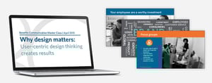
Why Design Matters: User-Centric Design Thinking Creates Results
Webinar
Benefits Communication Master Class series #6
This Master Class session focuses on user-centric design thinking—what it is, why it matters, and how it can make your benefits communication sing. Learn:
- Basic principles in and examples of user-design thinking—many of them are intuitive!
- How to incorporate them easily into benefits messages to create better engagement and better results.
- How to amplify your brand for benefits communication.
This webinar was previously recorded. View the full transcript below.
Why Design Matters: User-Centric Design Thinking Creates Results
Webinar Transcript:
Hello, everyone. Thank you for joining: Why Design Matters: User-Centric Design Thinking Creates Results. I'm Jennifer Benz, and I'm thrilled that you've joined us today. This is the last in our master class webinar series. We've had a great response to this.
This is the second year that we've done the master class series, and I'm just delighted with all the great questions and feedback we've been getting. If you haven't listened to the other sessions, you can access all of them on our website, as well as downloading all of the slide presentations. For this session today, you'll have the slides and the recording emailed to you after the event, so no worries. You'll have all the slides and materials at your fingertips after the event. At the end of the session today, we'll do Q&A, and you can type questions at any time into the questions module on the Go To Webinar control panel, and we'll get to those at the end of the session. Let's dive in.
You know good design when you see it, and one of our favorite quotes from Jared Spool is "Good design, when it's done well, becomes invisible. It's only when it's done poorly that we notice it." You absolutely know when you look at a piece like this, that it's designed well. It will grab someone's attention. It will pull them in even on a complicated topic like an HSA plan.
It'll do a better job than something that's very simple like this with a lot of text and no color and so forth. Even when we have lots of copy, something like this with color and graphics and blocks of copy is going to pull someone in, and be more approachable than this. But what is design thinking? It is something that we all do every day, whether you know it or not. I think a lot of times people are overwhelmed by the idea of design and say, "I'm not a designer," but really, design thinking and creating good quality design is about strategic presentation. It's about creating something that's the right design for the right place at the right time.
You wouldn't wear a tracksuit and bring a scribbled handwritten note to a corporate job interview when you have the perfect credentials. You would research the company. You'd tailor your resume and cover letter. You'd dress appropriately for their office and for that in-person interview. That's design thinking at its most basic level.
On the other side, if you were applying for a personal trainer job, things might be different. That is to say you are dressed for presenting the product that you want to present to the right audience. That is design thinking at its most basic. It's about taking into account the point of view of your specific audience, and really creating things that are tailored to that group to get them to act. The examples onscreen are some posters created for a company that produces the technology that enables games and movies.
You see: the strategic presentation captures that target audience's attention very carefully crafted for that audience. Another example, really, of how you draw in an audience to engage, so effective communication is all about creating results. You get there by applying design thinking to launch and create well-thought-out campaigns. Effective communication breaks down complicated concepts into easy-to-understand parts. For benefits, we have to remember that the information we convey is among some of the most complicated that many employees will encounter as part of their career.
We have to entice them to engage. When we can get them to engage, when we can entice them, then we can create action. The examples you see onscreen here are where we view strong visuals and strong messaging to pull people in, to really grab their attention and get them to act, ultimately. There are simple tricks with good design. When it comes to just breaking up information, creating charts, using colors, all of these things make pieces easier to scan; they keep the piece visually engaging, and they are about creating something that is for the audience that's going to have to digest it.
That idea of problem solving, of figuring out how to create something that is going to be the right experience for your audience and get them to do something—that's the core of good design. Problem solving is really the core of design. What I want you to take away today is that design is not a separate part of communication. It's crucial to the success of all parts of effective communication. It's really embedded into everything that we do with benefits communication, as well as the way that we design programs, the vendors we select, the administrators we choose, and so forth.
We've touched on design in all of the master class sessions so far: our overall approach to creating results, the three steps we talk about to create success with benefits communication, getting information online, communicating year-round, and using all of the tools and resources that are at your disposal—that is, at its core, design thinking and problem solving. All of the methods we talk about for making online communications the best and most effective are about design thinking. Building engagement and consumer-driven plans, using targeted communication, these are all ways to connect the benefits design and the organizational design and business strategy to the end materials that are created, and get someone to act. All of this is design thinking and at the core of design. What we want to do is think about how we simplify all of these complicated ideas and explain them in an easy-to-understand way that's going to engage people and get them to take a step, get them to create an action that's going to meet your goals.
Now, we know, of course, that your benefit programs represent a huge investment in employees and your company. Your employees are one of your company's greatest assets, and we know it is just simply not enough to have benefit programs available. We have to communicate them. We have to get people engaged in them. There's tremendous research out there that really speaks to how effective communication is the difference in benefits that are appreciated and valued, and ones that don't do a thing to add to the employee value proposition or loyalty to an organization.
Good design is often mistaken for the activity of making something pretty and making something just a little bit better looking. Of course, when something is well designed, it is beautiful, and it should be a piece that you want to look at. But really, the core of design is about creating materials and creating a whole experience with your benefits that is going to ensure that you meet your goals, and putting that extra investment in the design thinking and the problem solving. The planning is going to make the investment that you're already making and all of your benefit programs more successful. Let's talk about what we're going to cover today as we dig into and dissect branding and design and all of these concepts.
We're going to start first with talking about branding and really what that means.
We're going to talk about user-centric design and the principles that you can apply to all of the campaigns that you're doing, all of the activities that you're doing. We're going to talk about how to create a cohesive experience through communication campaigns, and then, a bit of thinking like a marketer. Again, if you've listened to all of the master class sessions so far, which I hope you have or you will go back and review them, a lot of these concepts are going to feel familiar, and they’re things that we've touched on in different ways. But this session is really about taking a deeper dive and giving you more expertise so that you can talk about design and you can also validate that it's a worthy investment for your organization. Let's dig in and we’ll start with branding. Branding has a lot of misperceptions. A brand, or branding, is used to describe a lot of different activities.
Really, we think of it as the biggest picture. It's the perceived emotional image as a whole. A brand is what people think of your company. Many people believe that a brand only consists of a few elements—the logo, maybe the colors, the typeface, the tagline—but it is so much more than that. Everything a company does, everything it owns, everything it produces should reflect the values and the aims of that business as a whole. That is the company's brand.
You can often exchange the word brand for the word reputation. That is really the core of what we're talking about: that consistency in what a company is all about, what's driving it, what it stands for, what it believes in, and why it exists—not just colors and typefaces and logos in the slogan. That bigger picture is what a brand is all about. When you think of it in that context, you see very quickly that everything is a chance to either build a brand or reinforce that brand, to add to a reputation or reinforce that reputation, or to detract from a brand and detract from that reputation.
I love this quote from Marc Benioff, the CEO of Salesforce. "To be effective, a company's brand must be consistent. A company must use its people, its products, and its messaging to consistently reinforce the same positive points it wants to demonstrate." That is absolutely true. A continuation of that quote above or of that concept: think about a delivery service that promises to meticulously care about your packages. They can't have dirty trucks. A bank that says it cares about customers can't have 20 people waiting in line and only two tellers on duty.
Brands can't break the rules of the promises they make. Those broken promises, those inconsistencies destroy trust and they detract from a brand. Marc Benioff also says many times, "A brand is a company's most important asset. A company can't own its facts. If the company's facts, speed, price, quality are superior to the competition, any good competitor will duplicate them or worse, improve upon them. What a company can own though is a personality, an emotional attachment. That's an asset that cannot be stolen by any competitor."
That is absolutely true for internal branding and internal communications, as well. Creating a strong brand, and reinforcing and nurturing a strong brand, is something that involves all parts of a company. It goes far beyond the visual look and feel, and far beyond things like the brand assets and what you'll find in the style guide. It really is every touch point for a company. When you think about branding that way, you can really think about how much of an opportunity benefits are for branding the company and branding that company's reputation and commitment to employees, especially because benefits are such personal topics, and because they impact not just the employees, but their families as well.
Unfortunately, many companies either forget about that internal brand audience or they treat them as an afterthought. That can be a big mistake, as well as a huge lost opportunity. The internal version of a brand and the way a company treats its people by and large is directly reflected in how those people treat customers and how they grow products and services. We can't think of a brand as something that exists externally only. That company's reputation, the values that they stand for—all of that is reflected externally, as well as internally.
When it comes to the visual representation of a brand, having a consistency externally and internally can go a long way toward helping people connect to and feel more trust and more validation in that internal experience. When companies ask, “Should we brand our internal communications?” Absolutely. Should they look like external advertising? Yes, in a way. They should have the same quality, the same effort put into creating a good experience for employees as for customers externally.
This is a great example of a really strong corporate brand from NetApp, one of our clients. Their external B2B customer communications have a very distinct look and feel, a strong brand represented. When we parlay that into the internal communication for benefits, there's more warmth. You can tell we're talking about things that are going to draw the employees in, but still, the visual consistency and that strength of the visual identity of the brand is there. The key takeaway is that a brand needs to be consistent across the board—both visually and in thought and thinking, and the way that you're creating that reputation.
Developing a strong internal brand—especially a strong brand for benefits that's inspired by your company's external brand, but tailored to your employee audience—is a tremendously valuable investment. Here's another example from NVIDIA, a company that produces chips for gaming. The posters that we saw at the beginning of the session were from them, as well. It's a very masculine, powerful, exciting brand. Here's the different but related approach for internal benefits communication.
True to the company's corporate brand style guide, but introducing photography of actual employees makes it more approachable, more authentic. It feels completely on brand, but you can tell that the audience is different, and the audience will know that it's something specifically for them. That's the overview on branding and how to think about both the external and internal brand for your company.
Let's look next at user-centric design. User-centric design is about taking into account the point of view and unique needs of your audience. It's design created for your audience with a message that's appropriate with a purpose to get them to engage. User-centric design thinking means starting with knowing your employees and their families. Who is that user? What are their ages, their demographics, the family status, their income levels, and their lifestyles? Who are they and what makes them tick?
You can look at so many different factors to understand this for your employees and their family members. This is something that we talk about in creating data-driven communications and the session around targeting and segmenting benefits communication. We have so much data about employees and their families, what type of work they do, their salary levels, the programs they're in, what they are using, what they're not. This is data that any marketer would absolutely kill for, so using that to design more effective benefits communication creates such a better result. When we start with knowing who that user is and what they value, then we can design, we can test, iterate, and repeat.
That's really the core of user-centric design. It's a process that's iterative to get to an end result that's going to be better quality and produce a better outcome for that user. The design is driven and further refined by looking at that user, getting them to interact with it, seeing how they respond, and then making changes or refinements, as needed. You'll often hear people say that if you're not designing for your user, you're only designing for yourself. That is something that happens a lot with benefits communication, or maybe you're not designing for yourself, but you're designing for your lawyers, which are definitely not your end user. Really, thinking about that person who's going to receive the piece of paper in their hand or going to be experiencing the website or watching the video.
When we think about that and we create this iterative process of design, we can move from one version to the next and improve along the way. A few things to keep in mind: This is talking about the whole structure of how you get someone to interact, not just the visuals. In any user-centric design process, usability testing connects different stages along the way. As you progress from something that's loosely defined to getting more definition, you're going to be gathering feedback to be able to validate your assumptions and improve things.
You want to focus on usefulness for that target audience and continuously refine and enhance based on data. This can be a process that's done before something is launched and it can be something that is done iteratively through the whole life of all of your resources that connect with benefits communication. When we talk about strategy being a cyclical process where you are defining your goals, creating a campaign plan, executing, measuring the results, and then doing it all over again, that's the nature of user-centric design and really building on the results year over year, piece over piece.
A few methods for digging into getting that user feedback: Really, user feedback or feedback from employees I think is often a missing component in benefits communication and it's something that a lot of times, employers really shy away from gathering for lots of reasons and lots of old myths about gathering user feedback and employee feedback.
Let's look at three different tools that are core to user-centric design and how we can use them for benefits communication and how you can use them very easily and effectively. We're going to talk about focus groups, surveys, and user testing. Focus groups are a great way to get employee feedback or a feedback from employees and family members. They're an easy way to get very in depth and nuanced feedback. They can be very easily organized and conducted, and we hear a lot of hesitation to doing focus groups either because it just seems like they're going to be too difficult or too time-consuming to orchestrate, or there's a fear that you're not going to be able to act on and use all of the employee feedback.
As far as organizing and conducting them, they can be very easy and very simple to orchestrate, as simple as getting your HR business partner engaged, sign up sessions, get some food there, people will show up, and you only need six or eight people per session. We found that that's really the ideal size to get great feedback and great dialogue. Then, you can create a very simple discussion guide, and the feedback you will get will be so valuable and employees will give you insights that there's no way to get without those individual conversations. As far as the fear about not being able to act on or use all of the information of focus groups, you can set those expectations up front in the session, but that should not be a concern that prevents you from gathering employee feedback. People are realistic, they understand the process, and you will get such great feedback that that concern over not being able to do everything that everyone wants should just be set aside.
When you use focus groups, you can do this both in an up-front planning strategy process, as well as throughout a campaign, throughout the life cycle of what you're doing with your benefits communication. Likewise, you can use surveys in many ways: You can do a survey when you're doing a plan for a new strategy or a new campaign or a new benefit program that you want to roll out. You can also do surveys all along the way and make them part of something that you just embed into the way that you're designing and orchestrating benefits communication. Surveys are, of course, a great way to collect feedback from a large group or on many topics.
They can be stand-alone benefits surveys or they can be embedded into other projects. If you have any internal employee value proposition work going on or internal engagement projects, see if you can get some benefits questions embedded into those surveys. Then again, build them into your ongoing processes. Figure out how you can be surveying employees and family members throughout the year, not just every once in a while.
User testing is a great way to test concepts, actual messaging, or designs. This is as simple as getting real materials in front of real people. There are many online tools that you can use to collect data if you want someone to experience your website or to engage with say a print brochure or the messaging that you want to use to launch a big campaign. You probably hear a lot about A/B testing. That's a method where you can essentially compare two designs or compare two messages to an audience and see which one creates a better result. There are lots of ways to orchestrate that user testing again, either at the beginning of a project or along the way once you have something out there and people are engaging with it, and using the resources and tools and so forth.
A couple examples of how we've embedded this into some very successful campaigns:
With Adobe, when we initially launched their benefits website, it was connected to a big HSA campaign, and conducting focus groups with Adobe employees allowed us to hear directly from them and what they wanted. We heard very clearly that they wanted to understand what's new, how to use a benefit, and what to do when things were changing. That's really how we crafted the home page to be aligned with that. The spotlight is all about what's new. The achieve section is about finding benefits you need to reach your goals, and act is all about life changes and getting more resources, or the right resources, at the right time.
This is all about communicating the way that employees want to be communicated to, or the way they think about these things. You might want to communicate about changes to your PTO plan, but they want to find out how they can take vacation and get extra time off when they have a sick kid or when they need to care for someone, for a family member. They want to know what happens when they have a baby. Thinking about this from the employee's point of view and creating a whole experience that's from their point of view is something that you can do by gathering that feedback and really crafting something with user-centric design.
Another example of that for Intuit’s population, employing similar methods created a different look and a different result. A major component of this website is about filtering the information so that everyone can see the programs that matter most to them and their life stage. You see right on the homepage, we have the six most important benefits in your 20's, 30's, 40's, 50's, 60's, and 70's, and then see how we can help you have more energy, fit into your skinny jeans, save for retirement, and so forth. We did this and gathered that feedback from Intuit employees in detailed focus groups, really actually using Intuit's own design for delight process. They are a design-focused organization, and so we followed their own methodology for doing that user-centric design and the practices that they use to build their software products to create this end result for their employees. For user-centric design, what you need to keep in mind is there are simple methods and simple ways to collect more feedback from employees and their family members, and create something that takes into account more information about their needs and how to make things most relevant for them.
Let's talk about creating a cohesive experience and how you get all of these different channels and different programs and different resources to work together. A big piece of this is about having a campaign, creating a strong campaign that is going to really grab people and pull them in. This is an example of a look and feel in a very strong visual identity tied to very specific action steps, assess, explore, plan, and act that we created for Applied Materials several years ago regarding their career development efforts. A really strong visual identity and action-oriented campaign, something that really speaks to their employees, puts us right in their shoes. All campaigns should have that cohesion. They should feel consistent with imagery and messaging and the desired action. It should be very clear to employees what you want them to do.
How do you do that? It comes down to three pieces: Having a strong theme and a visual identity. That's the visual side of design and the power of having something that is visually recognizable. Then, we want to connect the dots and make sure that we are creating a system where people know what to do and they know how to engage, and really thinking of things as part of that system of getting people to take action moving them along.
The first thing is to have a strong theme and a visual identity. This provides important visual clues for your employees. It helps them connect the separate pieces that they're going to encounter through work and at home, online versus print. The relation of that allows for repetition that builds towards an action. It may be that they receive a benefits guide at home as their first step, and then maybe they get a bulletin that says exactly what's changing from last year, and then an email says, "Now, it's time to act." You can go take action. There may be a poster on-site that iterates and focuses on those similar messaging. All of these pieces need to look and feel consistent so that employees know that they're connected, they know how to engage, and you are creating something that has that quality and branded identity that is going to enhance the value and the perception of your programs.
A big piece of this with both the strong visual theme—as well as the next sections on connecting the dots and thinking of things as all of a system—is repetition. While we would love for employees and their family members to instantly take action the first time they hear about something, chances are that's not going to happen, so repeating the messages, having multiple ways for people to access resources, that's a way that you can build momentum.
The second piece is about connecting the dots. This is really about making sure that each piece in the campaign serves a specific purpose, and that you don't try to do everything with every piece. An example here is a postcard doesn't have to tell the whole story. It needs to capture people's attention and give them a way to act. This is an example of a postcard that went out to employees, directing them to the benefits website. Once they got to the website, they had a path to go down based on their health plan that mapped out all of the information for them and made it a really easy process for them to know how to take advantage of the wellness program.
A very clear call to action on the postcard: Go to the website. Once you get to the website, it's very clear what you need to do and how you start to get down that path. This is all about getting a connection between each piece of the campaign and the actions that people need to take. When you think about that, you can see that it's all part of a system that you're creating.
When you're doing a communication campaign—and all of you are doing this all the time—you're creating multiple ways for people to engage. Your meetings and postcards and emails and videos, and putting posters up in the hall—all of this is about creating a system that allows each piece to focus on a single message, or as little or as direct of a message as possible. It also lets you use each type of media appropriately so that each piece reinforces the last, and you're creating multiple touch points for employees and their family members. You want to talk to people where they are, get them just the information that's needed at that time.
I think one of the biggest mistakes that we make with benefits communication is trying to pile on all of the information at once, and in every single piece that's out there, explaining all of the details. You don't need to do that when you think of things as a system and when you have good resources available where people can get more information, where they can go to take action, and you start to reinforce that those resources are at their fingertips all of the time. What's also important to think about here is that you're not creating any dead ends. You don't want to send out a piece that doesn't have a clear next action or doesn't have a clear place to get more detail. When you send pieces, you want to make sure that they push people to your website or to the administrator for more detail, that people know not just what it means to them, but what they need to do.
That is going to create a better experience overall for your employees with their benefits and reinforce the value of all of those programs because it's going to be easier for people to use them, and really getting people to use them—getting them to engage with programs—is key. That idea of how we get people to engage is really about thinking like a marketer. This is something we talked a lot about in the targeting and segmentation master class. It's important to keep in mind that you have an incredibly diverse and very distracted population to engage. There’s an incredible diversity of workers in every population.
I was on the phone with a company this morning that has a highly educated, highly trained corporate staff, as well as folks that are spread out in individual homes, and has a mobile workforce that's in their cars all day long. That difference—in income level, in environment, in a way that someone's day-to-day life is set up—makes for a really interesting challenge with communication. Also, we have to keep in mind that, employees and their family members are exposed to thousands of advertisements every day. They are powerful. They're emotional, at times. You could even say that advertisers are manipulative, and they're putting billions of dollars behind grabbing your employees and their family members’ attention and getting them to buy products and to do different things.
You have to compete with that. You have to compete with the Axe body spray commercials if you're talking to your younger employees. Those might be obnoxious. They might even feel offensive to a lot of people, but Axe has figured out how to connect with that target audience and how to get them to buy: That level of sophistication with targeting, and the data that goes behind marketing messages now, there's so much sophistication there that we have to compete with.
We're all bombarded by all of that noise, all of these things vying for our attention, and how you break through that and get people to care and get them to pay attention to what you're doing is going to take some extra work. Every so often, you have to just mix it up. You have to do something that's different, that's going to capture people's attention in a different way. If you've had an effective strategy in place for many, many years, figure at how you do something that's going to surprise people, that's going to give them a different way to think about something. Here's a couple of screenshots from a video you've probably seen, where they turned the staircase into a piano.
Things like that that are going to grab people's attention. Don't shy away from doing things that are fun that can influence behavior or get people to engage differently. You can also be dramatic to make a point or get attention. This is something that we shy away from far too much in benefits communication, not wanting to stand out too much, or to be too bold or too aggressive with the message. But you can be dramatic. It's often the things that are unexpected that are going to catch people and really get them excited about something, really grab their attention. That idea of being bold, of really thinking like a marketer, is something that is going to take your communication to the next level.
All right. Let's wrap up and move to Q&A. I see lots of great questions coming in. What I want you to take away from the session today is that design thinking is not isolated to the designers at the ad agencies on Madison Avenue wearing their black turtlenecks and stylish skinny jeans. The most successful companies apply design thinking to all aspects of their business.
You can do that with your benefits communication, and you can appreciate and acknowledge all the ways that you're already thinking in terms of design and for your employees. Bring that to life. Put a little bit more emphasis behind the design thinking to give your communications even more power. Think about how your internal branding can support the perceived value of the company, and how that brand can align with the business goals. Keep your audience in mind. Make sure that you're really designing for your employees and their family members, not for yourselves, not for your VP of HR, not for the legal team. For your employees and their family members.
Be strategic and thoughtful in how you create campaigns that are going to drive people to a specific action or specific behavior, and the ways that you can use all of the different media that we have at our fingertips and really let each type of media do their job the best. Also, look at ways that you can engage your audience creatively, that you can do things that are going to surprise and delight them, maybe even catch them off guard and create a little bit higher level of engagement or higher level of awareness. How you really engender design thinking and all that you do with your team is with that idea of empathy, integrative thinking, how all the pieces connect together, and there's a lot of optimism inherently built in here. When you're iterating, when you're thinking about the employees, you can be producing better results, always improving, always driving things forward. It takes a little bit of experimentation, at times, and, of course, collaboration across your team, but bringing this to life in the way you're thinking about benefits communication—the way you're thinking about how to design for your audience—can make things a lot more effective, and a lot more fun.
Keep in mind that humans are complicated beings and they contradict themselves all the time. When you accept that we're designing for a very complicated audience and that it's going to take some creativity and lots of ongoing effort, you can always be investing more and finding better solutions, more creative ways to get employees engaged, and more ways to get the value of your programs more embedded in all aspects of the employee experience and the way that they're thinking about their benefits, overall. That's a summary of design thinking. I want to move to Q&A. We have some great questions that have come in, already.
As you have questions, please just type them into the questions module on the Go To Webinar panel, and we'll get through all of those.
Q. Does everything have to be branded the company? Can't we use our carrier's brand or our carrier's off-the-shelf pieces for communication?
A. That is a great question. Not everything has to be branded by the company, but you're losing an opportunity to build connection to the employer and to the employment experience if you let your carriers brand their own materials.
Particularly, if you're offering a self-insured health plan, you want employees to know that that's your plan. You're paying for it. It's not Aetna or Blue Shield or Anthem. This is your plan and this is part of what they get as an employee. It's unique to them.
When you're talking about voluntary benefits or even wellness programs, making sure that people know how they're connected to your benefits is really important, and often, using the company's visual brand, that the company's visual identity is a way to build that connection and build that cohesion. That's not to say that, at times, it's not going to make more sense to use the carriers’ or the administrator's materials. There are always exceptions to that. When you're talking about case management or disease management programs, you probably want those very clearly branded that they're talking to the healthcare company, not the employer. There are some exceptions to that, but I would say, by and large, all of the messages you're communicating about benefits should be branded your company and you should be taking credit for that investment.
Q. What are the risks on having employee pictures and what if they leave a company or are impacted by organizational restructuring or depart? In the past, anytime I use employee pictures, I wound up needing to replace them, so there's added overhead involved.
A. Every organization has a different level of sensitivity around using their own employees for photos. I would say, if you have the appetite to use real employees and the budget for good photo shoots, then by all means, use real employees. It's just not that much to worry about if the employee leaves, especially if you're doing frequent communication. And using them in digital channels can make it a lot easier to be communicating frequently and using a lot of photos.
I think that the times that companies have really struggled with having employee photos or an issue with someone leaving is when they've used one big photo to highlight an entire campaign. That makes that one individual more visible, but using a variety of employee photos can be a better approach and cut down on that risk of what happens if one person leaves or if there's an issue with one person. That said, using stock photography absolutely works. If you get a look and feel for stock photography that's going to be consistent and connect to the campaign, it can be very successful. I would definitely—if you're going to use stock or you're going to use employee photos—spend a little bit more budget to get higher quality stock or higher quality photos. That's going to make a big difference.
One point on the employee photos is that people love to see their co-workers, especially if you're talking about wellness testimonials or how people use different programs. People love to see their colleagues and their co-workers. If there's a way to get more excitement about the materials by using employee photos, that's definitely worth investigating.
Q. Is it necessary to copyright our benefits communication materials and trademark a benefits logo?
A. It's not. It's not necessary to do that.
You certainly want to use the proper trademarks for your company brand and your company logo and any of the carriers that you're using, and so forth, but you don't need to copyright materials or go through the process of trademarking a benefits logo. If you want to be very cautious with your materials, I would focus on the disclaimers that go on print materials having just a few lines of text on print materials that are a legal disclaimer so that you can be more bold and have materials that are more engaging, but you don't need to copyright or trademark materials.
Q. What if we don't have a budget for designers and we have to do everything ourselves?
A. That's a great question. Keep in mind that design thinking and creating a better experience isn't just about the look and feel. If you're a smaller company and you don't have the budget to use outside designers or to invest in really bold materials, go for simplicity and create a cohesive experience. And really think about how to make the materials that you're producing and the resources that you're giving employees access to simple and easy to understand. If you need to create tip sheets or an email or a PowerPoint presentation, and it has to be on a simple template that can be produced by your own team, do that thinking about the employee experience in mind. Make that tip sheet as clear and simple and actionable as possible. Make the PowerPoint presentation very easy to go through. Put the time and energy into the messaging, making it very clear what people need to do, where they need to go for more information. It's not really about having a fancy look to everything, but clear, consistent messaging that is going to help people take action.
Now, that said, of course we know that one of the biggest challenges for organizations is not having big enough budgets for communication. In our Inside Benefits Communication Survey, we found that the vast majority of companies—about 60%—are operating on a communications budget of less than $25,000. That's just not going to get the job done. Use the information that we've shared and what we have in the other master classes. There's also great information in our Inside Benefits Communication Survey, and the research we just released with Quantum Workplace about the value of investing in benefits communication. It's very easy to make a business case for allocating more budget for communication, especially when you look at the overall cost of benefits themselves and that big investment that you're already making in the plans and programs.
Q. How do we make the case for focus groups? There's been a lot of hesitation in the past and a lot of fear about gathering feedback from employees.
A. We hear that a lot. We see a lot that companies have either had a bad experience with focus groups because they've been too difficult to orchestrate, or there's a big concern about them just becoming a session for people to gripe and to complain. You really need to look at the opportunity to gather feedback from employees, and if it's been many years since you talked to employees, focus groups are probably one of the least expensive ways to get better in touch with employees and really hear from them what they're feeling and what concerns and questions they have. They don't have to be expensive or overly laborious to orchestrate. Often, it should be someone other than the benefits leader who leads them—maybe someone from corporate communications or an HR business partner. But they're just such a great way to gather feedback and so valuable that when you're going through a big change or have any new investment and benefits, they can absolutely prevent missteps and help you be most successful.
Q. Another question about accessing all of the other master classes.
A. We have five other sessions for the master class series. All of them are available on our website. You can download both the slides, as well as listen to the recording. This one will be posted there, as well as emailed to you after the session, so please take advantage of all those resources and all of the information that's out there about making your benefits communications more successful.
Q. We have lots of participant information within our data and analytics. What types of data or demographics should we look at to get to know our employees better?
A. That's a great question, and absolutely everyone has tremendous resources and tremendous access to data through all the vendors and so forth. What I would really look at, in addition to just the top line demographics, is how employees are using the benefit programs. That is going to give you a better insight into where you can make adjustments and changes. In addition to looking at the baseline demographics, look at how people are using the benefits. It's very helpful when you do both of those not to look at an average across the whole employee population, but think about how you can create personas or a handful of employee profiles.
Maybe you have four very different business units that all have a different type of employee and a different type of work environment. Create a persona of what each of those environments is like, what those employees are like, and look at digging into the data from that point of view. What do the different types of employees in your workforce need, and how do they engage with the benefit programs? That will start to give you a really good look at where there are opportunities and where you can really push the envelope.
Thank you, everyone. Again, all the materials will be available online, and we appreciate you joining us. I hope all this has been very helpful, and look forward to connecting soon. Thanks so much.